The brand on the bottle: what the surface actually carries
Written by Pure Arctic
5 min read • Last updated: 30 August 2026
A branded bottle is not an advertisement in miniature. It is a physical surface that someone holds in their hand for a few minutes, and that then stands on a table long afterwards. That places different demands on the brand than a screen does, and those demands are worth knowing before the label is drawn.
Summary
The label is the smallest surface a brand has, and only part of the circumference is visible at once.
Printing is in four colours, CMYK, calibrated against the logo that is uploaded.
A fixed information panel is shown permanently on the label and is not available for design.
The proof shows how the print will look, and production starts only once it is approved.
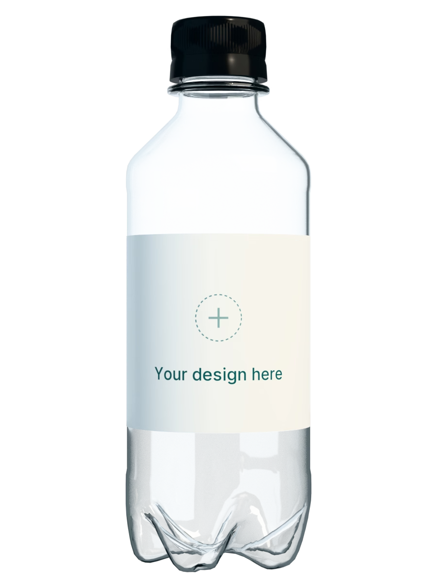
The surface is small, and it curves
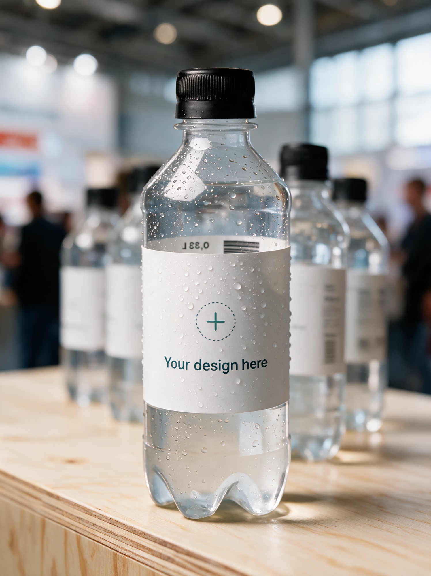
A brand expression built for a screen has all the room in the world and a flat surface to sit on. The label has neither. It is a few centimetres tall, it wraps around a cylinder, and only part of the circumference is visible from any one angle.
The consequence is that the edges are unreliable. Whatever sits closest to the edge is read at an angle, or not at all, depending on how the bottle is turned. The most important element therefore belongs in the middle field with air around it, and a horizontal band across the middle of the bottle lands whichever way the bottle is facing.
Height behaves differently from width. The label does not curve upwards, so the full height is usable. The width has to be planned around the fact that the recipient sees one section at a time, not the whole label laid flat on a table.
A brand is recognised on fewer elements than you think
A small surface will not carry an entire design system. Pick the two or three elements the brand is actually recognised by, usually the logo, one colour and a typeface, and leave the rest. A label that tries to show everything ends up as a surface without hierarchy, and then chance decides what the recipient sees first.
The colour deserves a thought of its own. Printing is in four colours, CMYK, calibrated against the logo that is uploaded. A digital brand colour does not always have an exact equivalent in CMYK, and that is one of the reasons the proof exists: it shows how the print will actually look, before anything is produced.
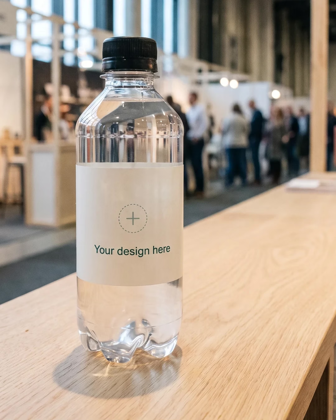
Contrast decides the rest. The label sits on a clear bottle with water behind it, not on a white screen. A logo in a single colour against a calm background is read faster than the same logo against a photograph, and it copes considerably better with poor lighting at a stand.
The information panel is part of the label too
Part of the label is not available for design. Mandatory information is shown permanently on the label, whatever else sits there. That is not a limitation to be hidden away, it is a piece of information that decides where the logo can go.
Account for it before the placement is settled, not afterwards. A design that assumes the full circumference has to be redone once the information panel arrives, and that round is easier to skip than to take.
The surface that remains is large enough. Brands with a tight expression often fare better here than brands with many elements, precisely because they have already decided what matters most when the space runs out.
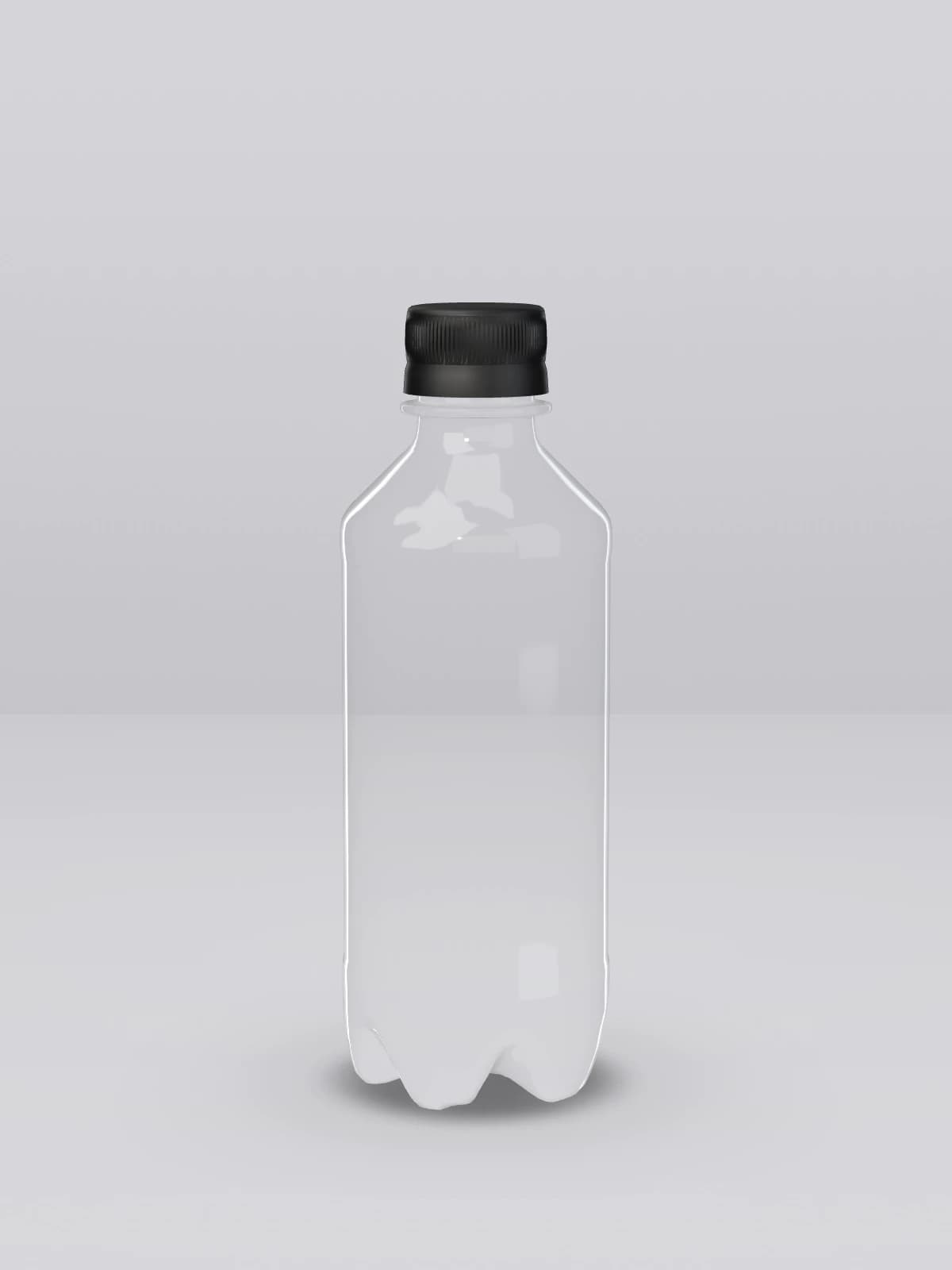
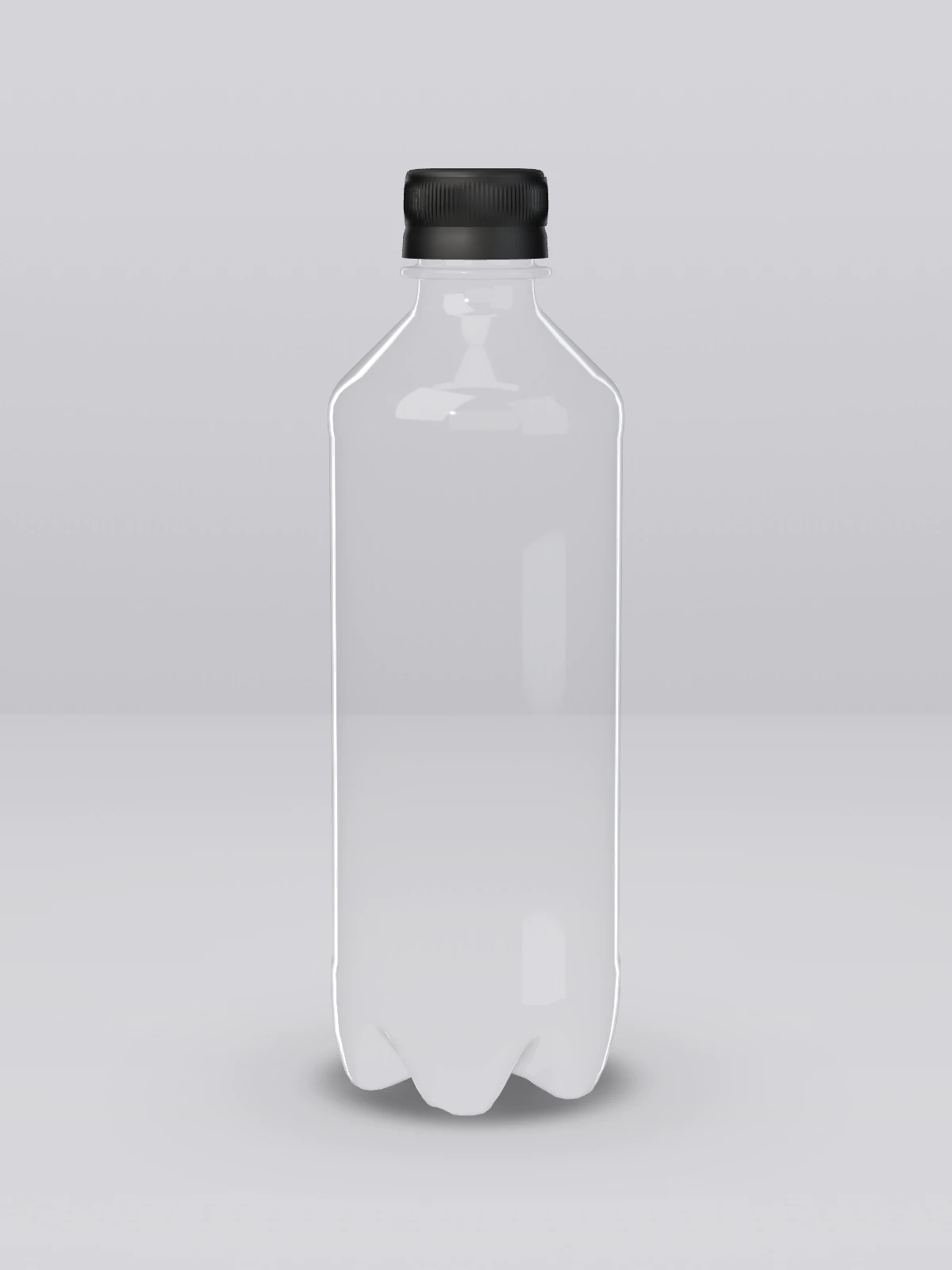
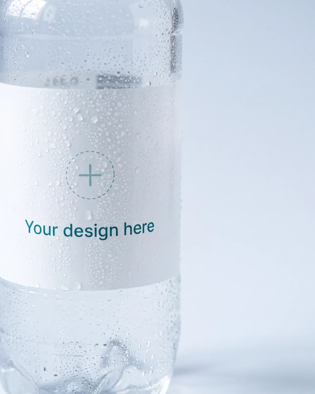
The bottle is r-PET, recycled plastic, and it is clear. The water is visible through it, and that shapes how the label reads: a light label merges with the contents, a dark one stands in contrast to them. Both work, but they give different impressions of the same brand.
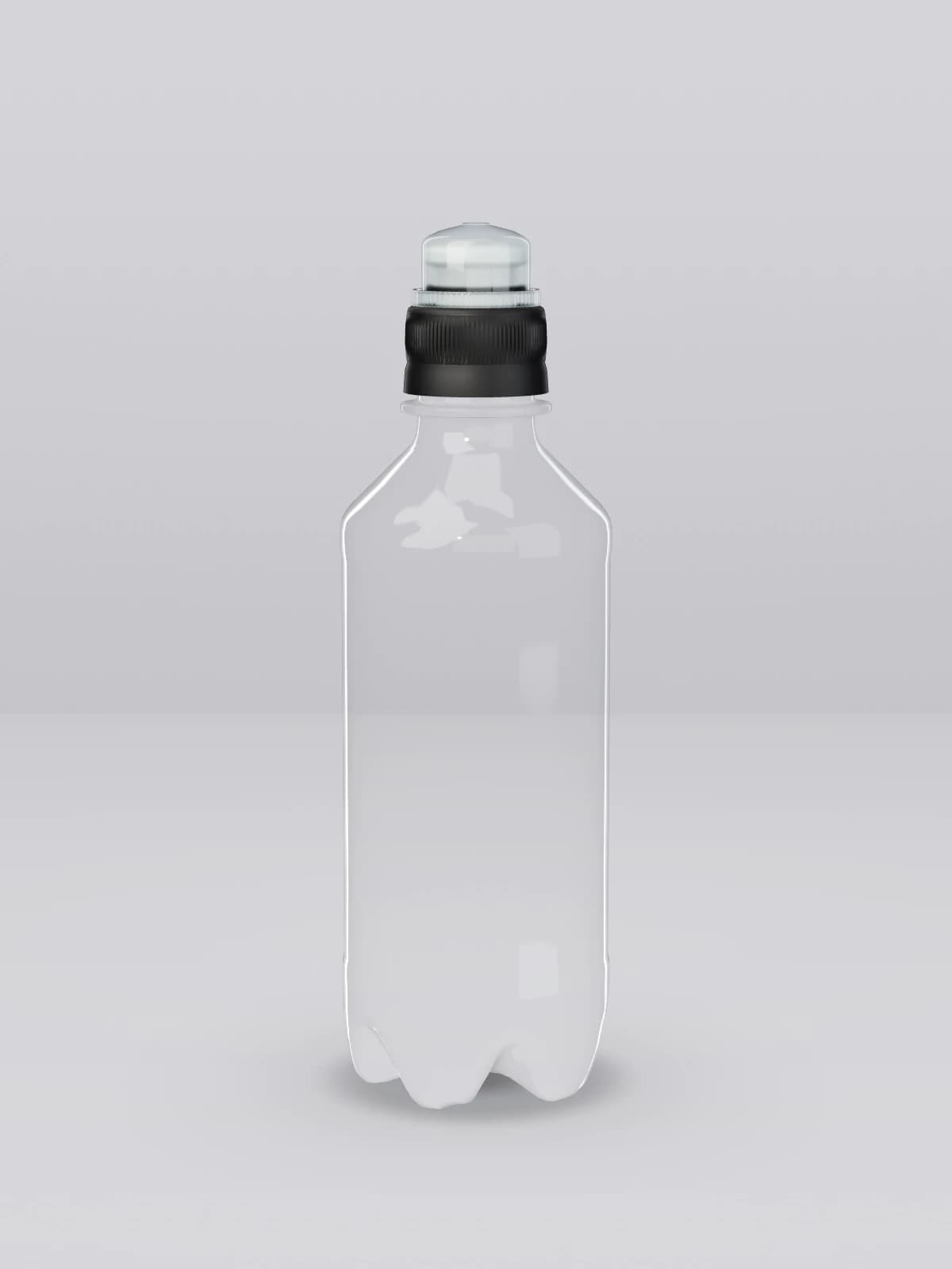
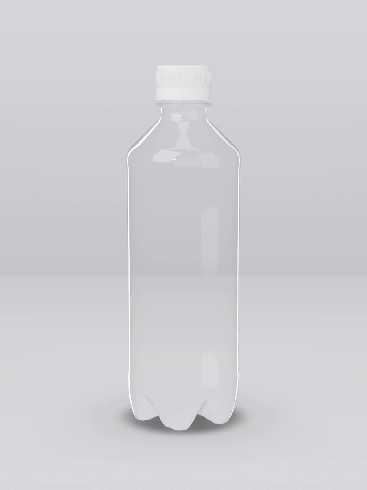
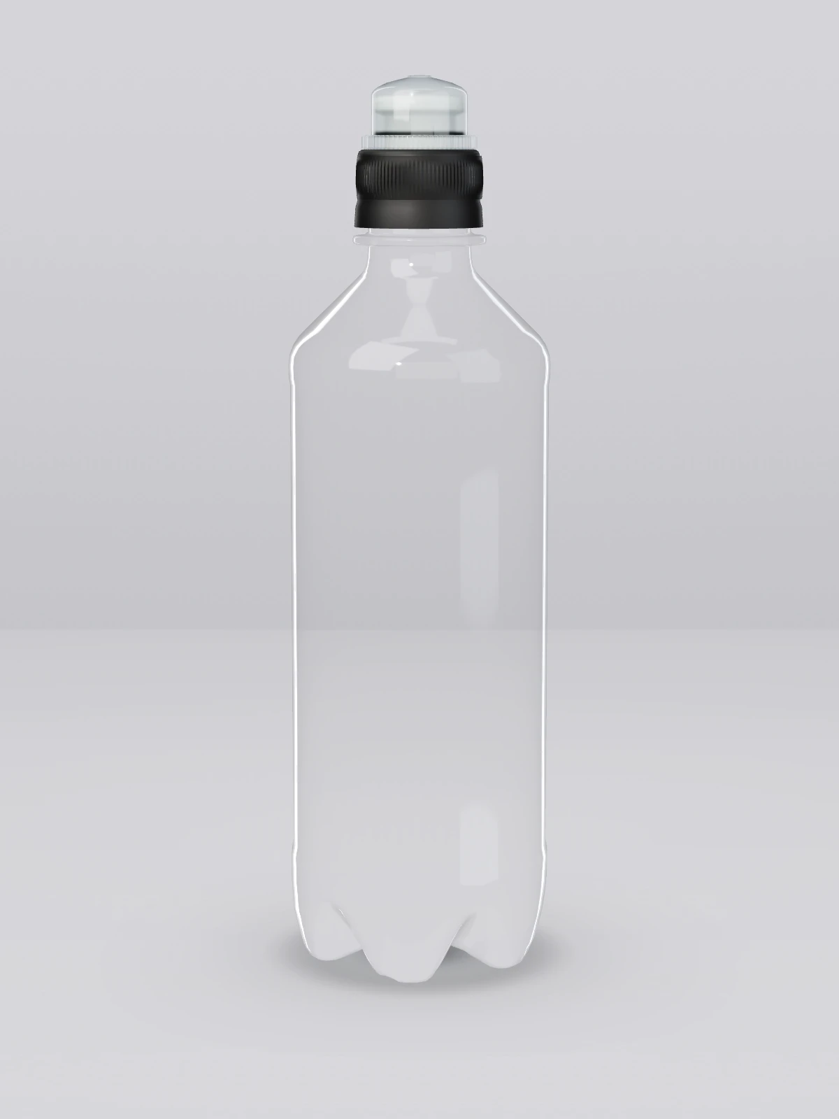
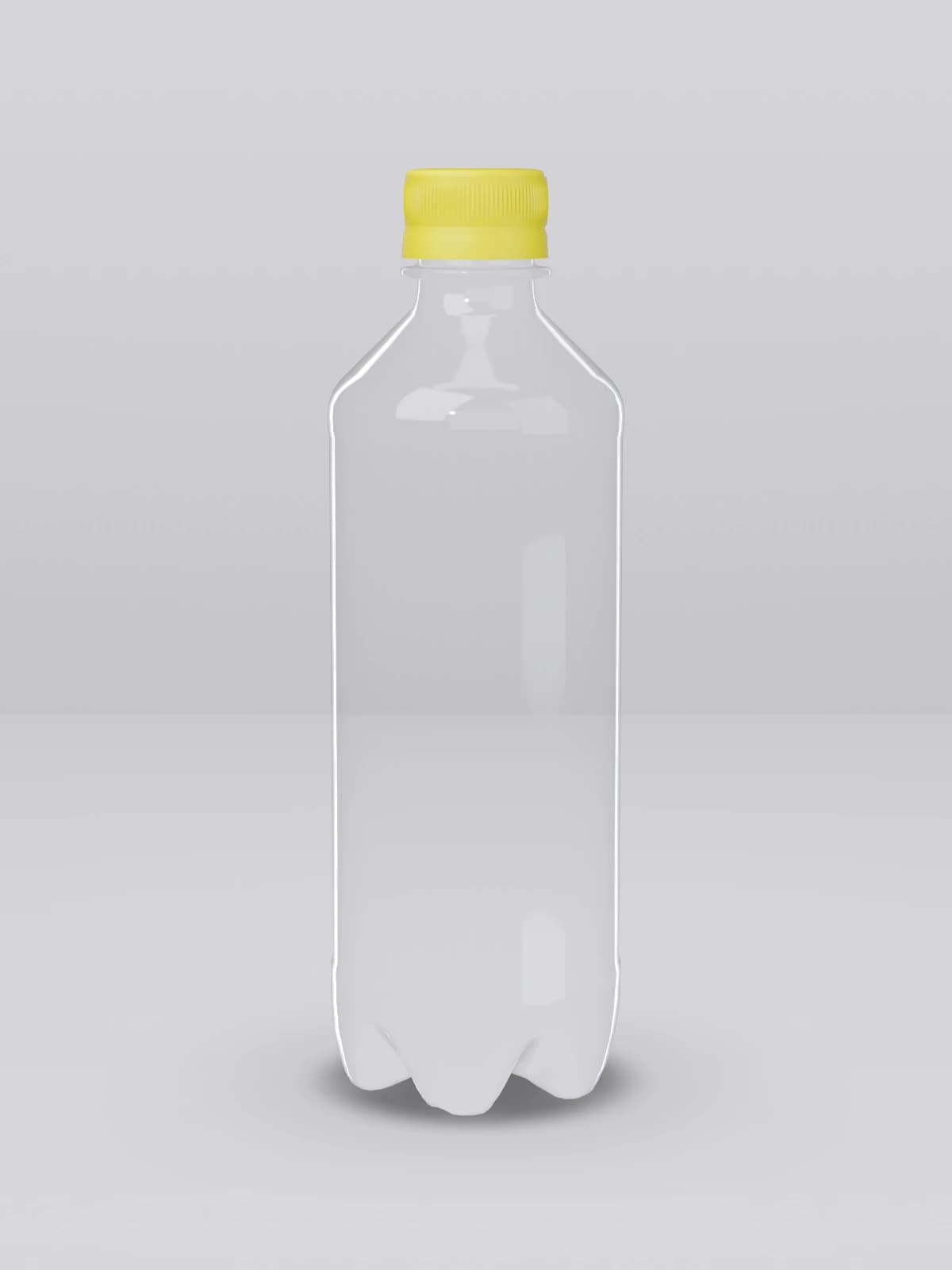
The cap is another surface. It is small, it is always there, and its colour is part of the overall impression even though it carries no print. It is worth seeing the label together with the cap before the design is locked, rather than judging it as a flat file on a screen.
The choice of material also belongs in what the brand says about itself, but it does not survive being shouted. Put r-PET in the product sheet and mention it when someone asks. A fact that stays still does more for credibility than a claim taking up room on the label.
From expression to order
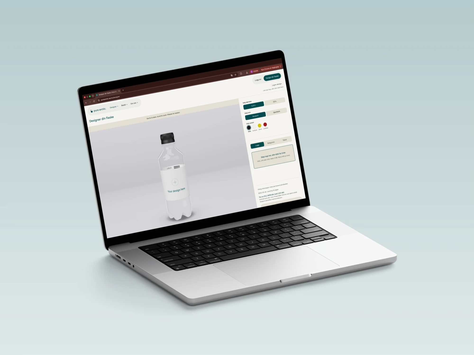
The Pure Arctic designer shows the bottle in 3D while the label changes, with the size and the cap that have been chosen. The design can be saved and passed around internally, so that the person who owns the brand sees the same screen as the person placing the order. Once the design is ready it goes on as a proof, and production starts only when the proof is approved. Five points catch what costs most to discover late.
The logo uploaded as a vector file, or as a PNG with a transparent background.
Two or three brand elements, not the entire design system.
The most important element in the middle field, with air out to the edges.
The label seen together with the cap and with water behind it, not on a white screen.
The proof read by the person who owns the brand, not only by the person ordering.
The material in a branded bottle is no longer only an environmental argument. Here is how regulation, the deposit return system and material supply look for Norwegian companies.
Legibility at two metres, space around the logo and a label that curves away from the viewer. These are the design decisions that settle whether the bottle gets used.
Quantity, timeline and size are the three decisions that settle whether the bottles are ready when the stand opens. Here is the checklist that keeps them in order.
4 min read
See the brand on the bottle.
Upload the logo and turn the bottle in 3D while the label changes.