How to design a branded water bottle that gets used
Written by Pure Arctic
5 min read • Last updated: 30 July 2026
A branded bottle left standing on the table has cost money without doing its job. The difference rarely lies in the budget. It lies in a few choices in the design, and most of them are made before anyone opens a design tool.
Summary
Decide whether the bottle will be seen from two metres away or in a conversation, and design accordingly.
Keep the logo in the middle of the label with space around it. The edges disappear around the curve.
Design for a cylinder, not for a flat sheet. Turn the bottle in 3D before you decide.
The proof is the last check, and production starts only once it has been approved.
Start with the situation the bottle will stand in
A bottle on a trade show stand is seen from two metres away, in light that is rarely good, next to fifty other bottles. A bottle in a meeting room is seen from half a metre, in calm, by someone who already knows who the sender is. The two situations do not carry the same design.
Decide the situation first. If the bottle has to catch someone passing by, the logo has to be large and the background calm. If it is there to support a conversation that is already under way, the label can carry more detail: a campaign line, a QR code, a short explanation of who the sender is.
Then pick one job for the bottle to do. A label that is meant to build a brand, show a campaign and explain a product all at once usually ends up doing none of them. It is easier to raise the effect of one clear message than to rescue three unclear ones.
The logo needs less space than you think
The most common mistake is to set the logo at full width and fill the rest with text. On the screen it looks balanced. On a cylinder the edges disappear around the curve, and the text nearest the edge is read at an angle by everyone who is not standing directly in front of the bottle.
Keep the most important element in the middle of the label. Give the logo space on all four sides, and let the background be a plain surface rather than a photograph with a lot of detail. A logo in one colour against a calm background is read faster than the same logo against an image.
Upload the logo as a vector file, or as a PNG with a transparent background.
Check the contrast against the background colour of the label, not against the white screen behind it.
Keep text away from the outer edges, where the label curves away from the viewer.
Use one type size for the most important element and one for the rest. Three levels become noise.
The label is a cylinder, not a sheet
A design made in a flat document behaves differently on a bottle. The middle comes towards the viewer, the edges bend away, and a horizontal line that looks straight in the file can appear to slope once it is printed and wrapped around the bottle.
That is why the 3D view is more than a nicety. Turn the bottle, look at the label from the side, and see how much of the text is actually legible from one angle. That is the angle the recipient gets, and it is always narrower than the flat file suggests.
Height behaves differently from width. A design can happily use the full height of the label, because the height does not curve, while the width has to be planned around the fact that only part of the circumference is seen at a time. Put the most important content in a horizontal band across the middle of the bottle, and it lands whichever way the bottle is turned.
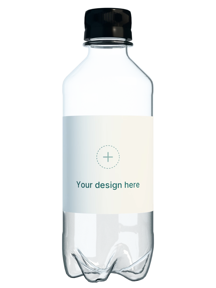
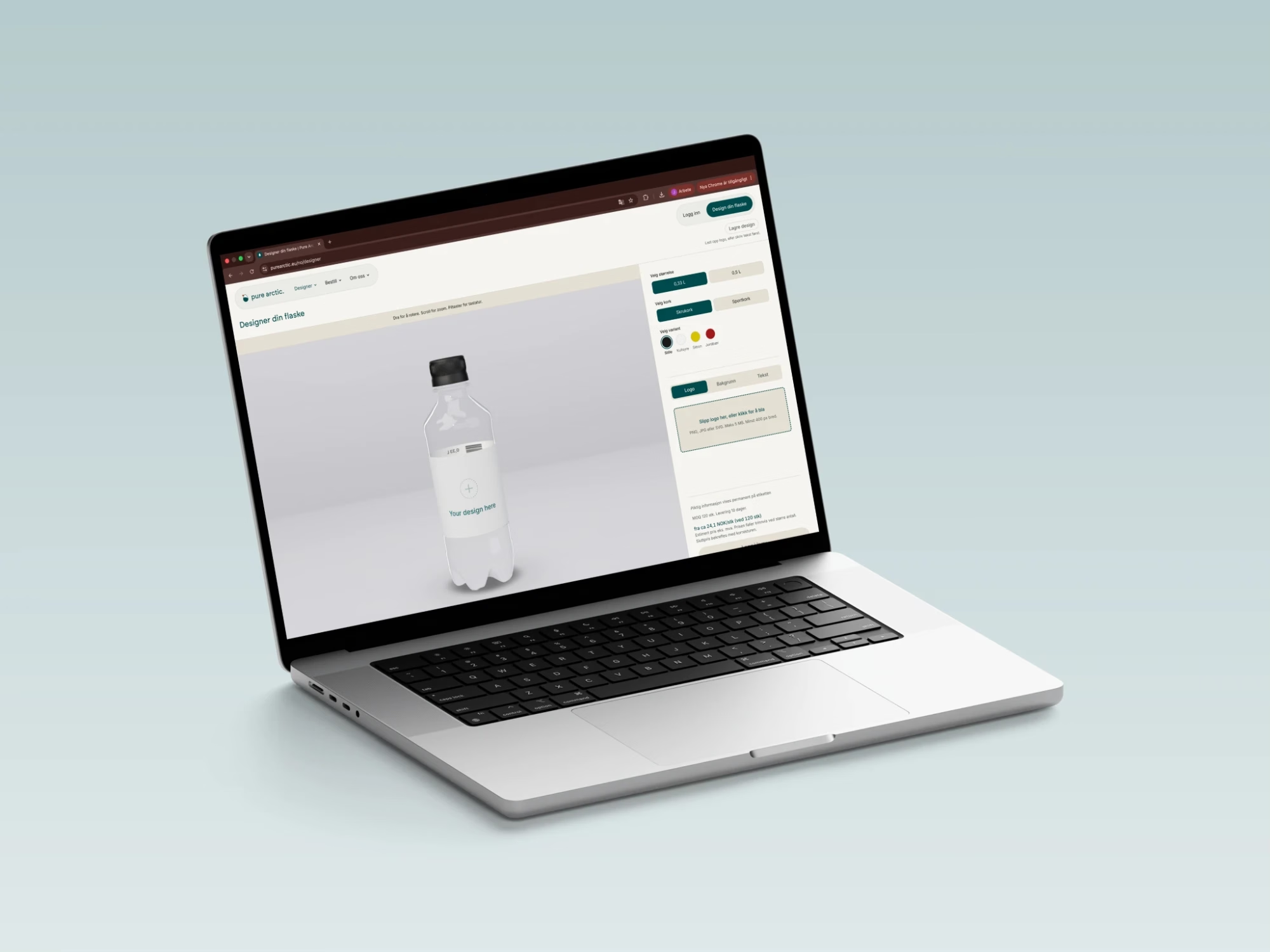
The Pure Arctic designer shows the bottle in 3D while you work, with the size and the cap you have chosen. The price updates in the same screen when the quantity changes, so design choices and budget hang together along the way instead of meeting for the first time at checkout.
The design can be saved and opened again. That is worth using when several people have a say: send the link round internally, let the marketing manager and the person who owns the brand look at the same screen, and get the objections in before anything is ordered. The discussion about logo size is shorter when everyone is looking at the same bottle.
When the design looks right, it goes on as a proof. The proof is the formal check before production, and production does not start until the proof has been approved. It is always cheaper to move a logo in the browser than in a file that has already been released.
The checklist before you send
Five questions catch the mistakes that cost the most. They take a few minutes to go through, and they are easier to answer before the proof than after it.
Is the logo legible from two metres away?
Does everything important have at least a finger width of space to the edge?
Does the design work against the colour the cap actually has?
Is there a way onward on the label, a web address or a QR code?
Are the files uploaded at full resolution, rather than pulled from a website?
The material in a branded bottle is no longer only an environmental argument. Here is how regulation, the deposit return system and material supply look for Norwegian companies.
Quantity, timeline and size are the three decisions that settle whether the bottles are ready when the stand opens. Here is the checklist that keeps them in order.